Make Your Website Work Across
MULTIPLE DEVICES
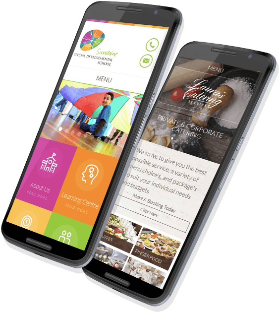
Mobile Websites for iPhone, Android, Windows and Blackberry
Build a website that showcases your business on every screen from smartphones and tablets to computers and TVs. Your customers expect a great browsing experience regardless of what device they use.
Did you know that more and more of your customers are searching for your business from their smartphone?
According to Google, 95% of smartphone owners use their smartphone to search for local businesses. If you don’t have a mobile website, then you are losing sales.
Did you know that only about 5% of small businesses have a mobile website?
If you are a service business like a plumber, heating &air contractor, a restaurant, or a retail store, then you absolutely need a “thumb-friendly” mobile website.
When people search for your service on their smartphone, they are ready to buy or to contact you.
Don’t miss out on mobile marketing!
Mobile Optimize Your Website Easily
It’s the easy cure for “reverse pinch!” You know that ailment… While viewing a website on a mobile phone, the thumb touches the index finger, then must sweep apart in an attempt to view a website intended for a computer screen.
Do your website visitors suffer from “reverse pinch?” Choose Magnetic Media, and your website can easily be mobile-optimized! You can be up and running in a few days. Magnetic media is now your answer to making your website mobile-device friendly.
You can get started right now. Best of all, when you make changes to your website, those changes are automatically made on your mobile website, too. Now there is no reason for visitors to strain to view your website on web-enabled mobile devices.
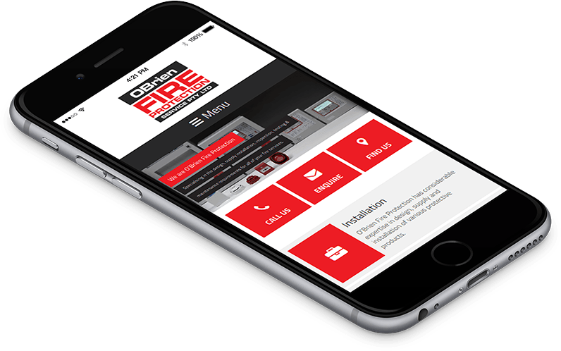
Call with a click
We analyzed over 500 business websites, and found that an average of 18% of their visitors call when the website has a click-to-call button. For some websites, that number is as high as 63%.
By adding this simple feature to your mobile website, you can capture potential business that other competing websites are missing. Reaching your intended audience is the first step, but making it simple for them to reach out to you is the key.
Magnetic Media can add this important feature to your mobile website.
Smart Websites for Smartphones
When your website looks and works just the same on a smartphone as it does on a computer, you are leaving so much functionality on the shelf. If you don’t have a mobile website, you are just as guilty of “potential waste.”
For example, automatic-click-to-call, maps and directions auto-links, and business SMS information can make your website so much more functional on a smartphone. And as new smartphone features are released, your website will be ready with tested performance-enhancing capabilities, even as screens get larger.

Real-time sync with your desktop website
We know that when you make changes to your website that it is too time-consuming to duplicate those changes to your mobile website. With Magnetic Media’s mobile-optimization, changes you make to text, images, or content are automatically changed on your mobile website.
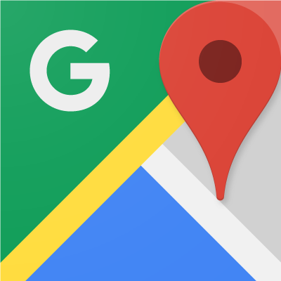
Link to Google maps and directions

Ready for WordPress
If you use WordPress as a blogging tool, you no longer have to depend upon bland mobile designs. With Magnetic Media’s mobile-optimization, you can create the look that’s perfect for your mobile website. You have put a lot of thought and time into creating the perfect website for your blog. Magnetic Media understands that, and can help set your mobile website apart from your other competitors.